It can be tough for companies to make what's on the outside of their products reflect all the work that goes into making what's on the inside. Here's how one farm-to-fork brand did it.

Eight years after debuting MM Local, Jim Mills, CEO and co-founder, realized his company’s branding wasn’t doing his products justice.
The Colorado-based company works directly with 15 organic family farms across the U.S. to source fruits and vegetables for its probiotic line of jarred sauerkrauts and kimchis, small-batch pickled vegetables, and apple and pear sauces.
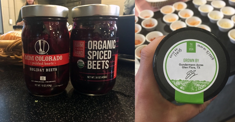
As it gears up to grow its retail presence and its roster of farmers, the company recently debuted a new look and a new name, Farmhand Organics, which Mills says better reflect its mission and ethos. The probiotic line is the first to bear the new branding, and the rest of the products will transition in January.
Here, Mills walked us through the rebranding process and how Farmhand Organics tells its brand story.
How did you know it was time to rebrand?
Jim Mills: It started as really a feeling or intuition that I had that we might not have our brand and our messaging quite right. That started about 18 months ago. And so what started as an intuition led to us doing some consumer research. It turned out people really didn’t understand who we were, nor could they actually pronounce our brand name—is it mmm local and we forgot an M? Or is it M and M? At the same time, we found out how much our customers valued a lot of the things that we were doing in terms of rolling up our sleeves and working directly with family farms to make the highest quality products that are certified organic, and that we offer 100 percent traceability and connection to the farms growing their food.
We learned a lot from that and said, we’re doing a lot of things well as a brand, but it just became clear to me that we really—not only for our company but for our farm partners and retailers—should have a brand that more directly communicates what we do.
Once you had that intuition, what were the next steps to starting to rebrand?
JM: We did some internal brainstorming, and worked with an independent art director and just looked at a bunch of names. At the end of the day, we decided that Farmhand is a name that really says what we do—rolling up our sleeves next to our farm partners to preserve the highest-quality products. When you’re in the retail industry and you’re on the shelf, there’s lots of different options, and a lot of time you really only have 1 or 2 seconds to communicate who you are and how you’re different.
What elements of the packaging did you change, and why?
JM: Emphasizing the clear labels is a really important part of our brand, so that people can see the food. We updated our farm traceability sticker on the top of the jar, so it now has the actual signature of the farm with the backdrop photo of that farm itself. And then we also wanted to make sure that we were emphasizing that the products are organic and naturally probiotic, for our probiotic line.
Then there were a couple other design cues. The line design on the label was inspired by crop rows, and our Farmhand logo still carries the original fork and pitchfork from our original MM Local logo, so that’s part of the heritage of the company that we wanted to carry forward and speaks to us being one of the pioneering farm-to-fork brands in the industry.
How did you go about communicating this change to your customers and consumers?
JM: We worked closely with several of our retail partners throughout the process and bounced some initial concepts off of a few of them. In terms of the consumer communication, we sent out a newsletter to our email list and promoted that we changed our name on social media. I think what’s been helpful for us is that the products aren’t changing, the UPCs aren’t changing, and it’s the same recipes and the same farms.
How do you evaluate the success, or failure, of the rebrand?
JM: At the end of the day, it’s based on sales. How well are we communicating our brand, and are we selling more jars in stores, and are we able to, in turn, buy more produce from our farmers? Initial results have been very positive—we are already seeing a 20 percent year-over-year increase in velocity with stores carrying the new branding.
About the Author(s)
You May Also Like


