Americans are getting fatter and fatter—and this infographic from Visual Economics helps explain why.

Carlotta Mast, Senior Vice President of Content and Market Leader

January 14, 2011

1 Min Read
What the average American consumes in a year

Americans are getting fatter and fatter—and this infographic from Visual Economics helps explain why. Sometimes pictures really are more potent than words.
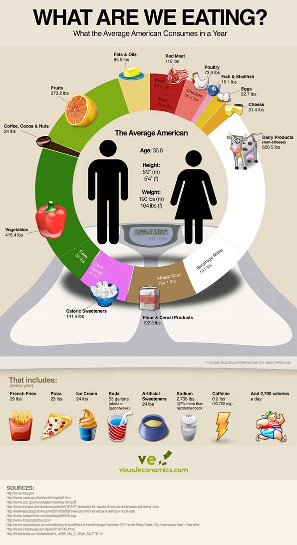


What are Americans eating?

About the Author(s)

Carlotta Mast

Senior Vice President of Content and Market Leader, New Hope Network

Carlotta leads the New Hope Network Content Team, producing all content and conference programming for Natural Products Expos, NBJ Summit, Esca Bona, Nutrition Capital Network, Natural Foods Merchandiser, newhope.com, Nutrition Business Journal and the NEXT portfolio. In addition she is the chief author of the NEXT Natural Products Industry Forecast. With 20 years of experience, Carlotta has her finger on the pulse of new health, wellness and natural product trends and the forces shaping consumer attitudes and behaviors.

Subscribe and receive the latest updates on trends, data, events and more.
Join 57,000+ members of the natural products community.

You May Also Like