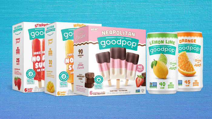
These brand makeovers both big and small arrived just in time for spring.

Whether its main purpose is to communicate a company's sustainability mission, convey important instructions for use, catch consumers' eyes on shelf or all of the above and more, packaging is a fundamental element that every brand must contend with.
Rebranding, therefore, is about more than just a new stroke of color or a different font. It’s an investment of time, effort and money, and one that can often launch a company on the road toward success.
It’s vital to remember these things as we look at these 22 recent natural products industry rebrands and celebrate their inspiring new looks as we spring into 2020.
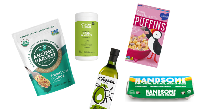
Among the many highlights is Chosen Foods’ new, artistic branding that “highlights the company’s roots in coastal California and central Mexico and celebrates the Baja Med lifestyle,” according to the company's announcement. CleanWell’s new design is a reflection of the brand’s goal to raise the line’s profile at retail, while Base Culture hopes to strengthen its branding and name recognition with a beautiful and colorful new look. For its part, Ethan's has combined it's rebranding with a more sustainable packaging design that uses aluminum caps instead of plastic.
Barbara’s Cereal has also turned to color for an eye-catching rebrand that seeks to provide a fresh take on traditional style. According to statements made by Michelle Gomez, the brand manager of Three Sisters, “in looking at the natural cereal set we saw an opportunity to standout by infusing more life, vibrancy and joy through our packaging. We’ll always remain true to the delicious flavors and innovative spirit that Barbara’s has embraced since day one, but we also understand the importance in listening to our dedicated fans and evolving to better serve them.”
New look, new name
Some brands have even accompanied their new designs with a name change. Dry Soda Company has become Dry Botanical Bubbly and its new packaging features bright watercolor paintings by the artist Magrikie Berg. Country Archer has changed its name to Country Archer Provisions and The Coconut Collaborative is now The Collaborative. 34 Degrees, which revamped its logo along with its packaging design, also updated its "Natural" flavor's name to "Original."
Have a recent rebrand you’d like us to feature? Please contact us at [email protected].
About the Author(s)
You May Also Like


