

Subscribe and receive the latest updates on trends, data, events and more.
Join 57,000+ members of the natural products community.
A smart rebrand helps Lawless Jerky better communicate its company ethos.

When Matt Tolnick and Dan Kaplan founded Lawless Jerky in 2013, as with any food startup, controlling expenses was a priority. When the time came to design the grass-fed jerky’s packaging, Tolnick says they paid an illustrator hired online just $100 to create a close-up image of what was supposed to be Lady Justice peeking beneath her signature blindfold—a cheeky nod to Tolnick’s past as an attorney.
Despite the rudimentary package design, Lawless Jerky steadily grew over the next five years, reaching millions of dollars in sales. But recently, both Tolnick and Kaplan felt a packaging change was necessary to continue their impressive growth. We chatted with the founders to learn what factors drove their new packaging decisions and how the rebrand better communicates their brand story.
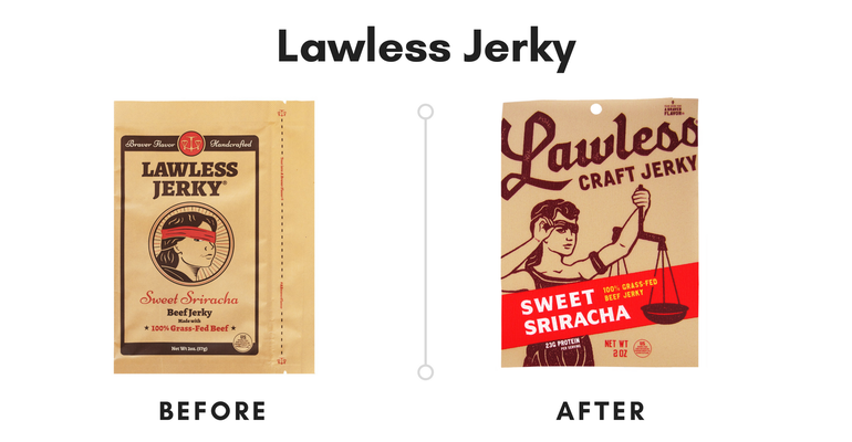
Where did the idea of the “Lady Lawless” character on the front of your package come from?
Matt Tolnick: She was inspired by the style of a poster print I saw in a frame shop. That zoomed-in Lady Lawless face for the most part did really well for us. Even folks who didn't know we were a beef jerky company would come up to us liking our brand shirt. Some even thought it was a rock band T-shirt.
But one of our largest retailers gave us feedback that the zoomed-in image with the blindfold could be interpreted as a symbol of female bondage or oppression. We've always thought of Lady Lawless as defiant, strong-willed, bold and proud like our "Braver Flavors." So that didn't sit well with us—and it partially inspired the rebrand.
Dan Kaplan: Our fans have always been very supportive with their feedback, and we considered all of their critiques as we strived to make our incredible jerky and on-trend packaging even better.
Personally, I thought the character was an outlaw from the Wild West on your old packaging. How are you now communicating that Lady Lawless is based off of Lady Justice?
MT: We thought by zooming out on Lady Lawless and showing her with the scales and with the traditional Lady Justice garb, we might have fewer misunderstandings. She now appears more as the defiant, spirited figure we wanted her to be because she’s lifting her own blindfold. In doing so, she too is a riff on my leaving law, co-opting that legal symbol for our own lawless purpose.
We also try to give a fine attention to detail, whether in our jerky or on our bags. We've even given Lady Lawless a little tattoo for people who inspect the bag really closely!
The bag itself has a very unique texture—it’s plastic, but it feels almost like paper. Why was the texture of the new bag important?
DK: We decided to move away from craft paper for our packaging to ensure our jerky maintained a “Braver Flavor” and stayed fresh even longer. But, we didn't want to separate from our craft jerky mantra and heritage. I searched long and hard to find a packaging provider who could keep our paper texture without compromising on product quality.
We merged [the bag] with our new logo, our improved Lady Lawless image, and our more dynamic layout to keep our grasp as a premium craft jerky.
You May Also Like


