Packaging spotlight: 4 illuminating natural product rebrands
These companies recently unveiled new packaging updates that help clarify what's inside.

We ask a lot from product packaging. Not only must it encase carefully crafted foods to prevent spoilage and extend shelf life, but it must also communicate exactly what's inside to inspire consumers to buy it.
Listing ingredients is only part of packaging's many duties. Successful packaging updates render the flavors more visible, expand the health callouts and use certification seals such as USDA Organic, Non-GMO Project Verified and even the new High Pressure Certified label to provide information about how the product was manufactured.
Check out these new and noteworthy packaging updates to learn how brands are freshening up their look for greater sales.

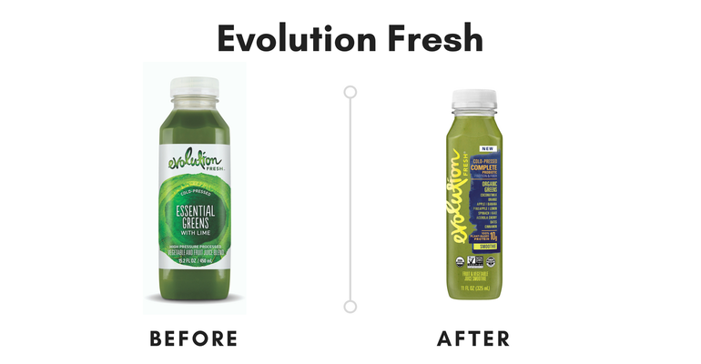
This new package is designed to expand Evolution’s look from just a cold-pressed beverage to a functional beverage. In a bid to improve product transparency, ingredients are listed on the front of the package so consumers can see what they are tasting. Health callouts such as protein and probiotics are more prominent, displaying the beverage’s functional nature. And, importantly, the bottle’s label is now see-through. According to the company, “Juices have completely transparent bottles and labels to showcase the vibrant spectrum of each juice’s ingredients and the natural separation that occurs.” Also note that Evolution is one of the first brands to incorporate the Cold Pressure Council’s High Pressure Certified Seal into product packaging.

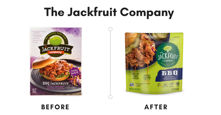
An impressive new packaging design for a product that most Americans haven’t even tasted. The Jackfruit Company enhanced the fun feel of its brand by taking the product out of a box and displaying it in a pouch emblazoned with an attractive close-up of stewed jackfruit. A new logo features the jackfruit tree (rather than the actual jackfruit, which looks kind of like a lima bean), allowing consumers to better understand where the main ingredient comes from. Another good idea: Simple icons on the front of the package show shoppers how to use jackfruit, such as adding the meat swap to sandwiches, rice bowls and pizza.

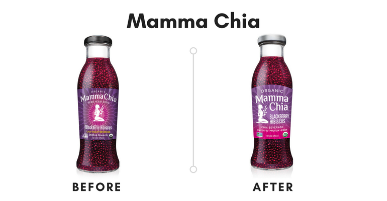
Subtle changes in the packaging design can offer powerful results. Most obviously, Mamma Chia expands brand recognition by enlarging its logo and the delicious-sounding flavor, “Blackberry Hibiscus.” The company also made the USDA Organic and Non-GMO Project Verified certification seals larger so consumers see them immediately. On the back of the package, this new design also contains enhanced nutritional callouts such as omega-3s, plant protein, calcium and fiber.

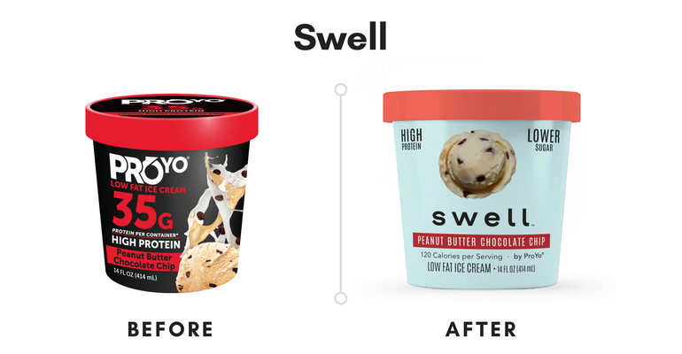
After a radical rebranding from ProYo to Swell, this high-protein ice cream now seems less for the body builder crowd and more for wellness enthusiasts. The big “35 grams protein per container” is removed; “120 calories per serving” is added. “The new Swell name and our premium design not only allow us to better target shoppers of our category, but also expand into exciting new categories in the future,” says Nathan Carey, founder of Swell. According to a press release, the clean, oceanic blue background is designed to pop on the shelf, and will better resonate with both female and male buyers, as well as those looking for a better option for their family.
About the Author(s)
You May Also Like


