Packaging spotlight: Before and after 4 excellent natural rebrands
Check out the attention-grabbing new package redesigns soon to be on store shelves.

Strategic call-outs on food and beverage packaging can meaningfully attract more core consumers to a brand. These four new package redesigns offer a salient look at how successful emerging companies use product mini-signage to communicate their chief differentiators.
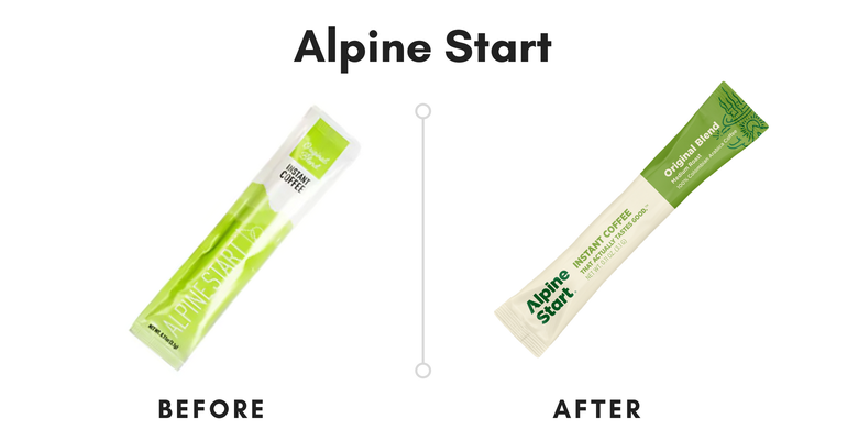
For example, Alpine Start had “Instant Coffee” printed on its earlier packaging. This is a great start. But the new tagline, “Instant Coffee That Actually Tastes Good,” is even better.
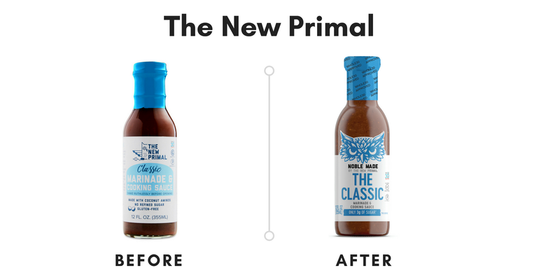
Likewise, The New Primal’s recently rebranded line of marinades and sauces, called Noble Made, feature a highly visible Whole30 Approved logo. This makes it easier for potential consumers who embody Whole30 values to find this specific product.
Scroll through more examples of these excellent packaging updates, and incorporate some of these ideas into your own brand.

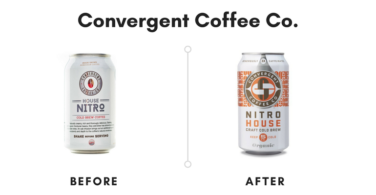
With stylized design and hip colors, this significant packaging rebrand is intended to elevate the overall aesthetic of Convergent Coffee’s Nitro Craft Cold Brew for dedicated coffee enthusiasts. “The cans boldly display Convergent’s meaningful points of difference: nitro-infused, generously caffeinated up to 3x hot brew, certified organic and fair trade, and low in calories,” according to a press release. We love this new packaging due to its art deco-inspired pattern (that seems to be inspired by the coffee beans themselves!).

An interesting extension by The New Primal (a brand most known for its jerky), Noble Made now is the line name for five new Whole30 Approved marinades and sauces which will launch at Whole Foods Market nationwide mid-June. Note that the new sauces feature an owl, which jives with The New Primal’s tagline, “Choose Wisely.” Plus, the plastic wrap around the closure further denotes the Whole30 Approved certification, making it more visible on store shelves.

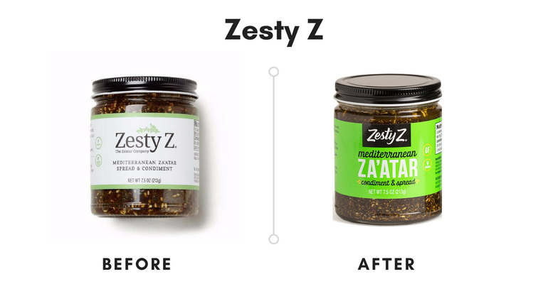
Check out the eye-catching new color palate adopted by Zesty Z, maker of the increasingly popular condiment Za’atar. Notably, the word “Mediterranean” is much larger and noticeable on the updated design—perhaps due to this region’s superior health attributes. Also, the “Zesty Z” font is more fluid, which connotes a more fun, playful feel. Of course, the neon green color will pop at retail.

The launch of two new product flavors (Coconut Creamer Latte and Dirty Chai Latte) was a perfect time to update Alpine Start’s packaging across the entire line. All sachets of the brand's instant coffee will soon feature bright new colors and a bold, memorable logo designed by the Los Angeles-based artist Alvaro Ilizarbe. We dig the tagline, “Instant Coffee That Actually Tastes Good,” too. It's straight forward, to the point and easily understandable.
About the Author(s)
You May Also Like


