It’s now been some time since one of the most overstimulating experiences otherwise known as Expo West. I always need a moment to recover and make sense of everything I saw. Clearly, CBD and plant-based anything dominated the innovation and communication trends–but what about packaging trends? As I scanned through my notes on food-crusted paper and reviewed the hundreds of photos I snapped, a few key branding and packaging design trends really stood out.

White renaissance
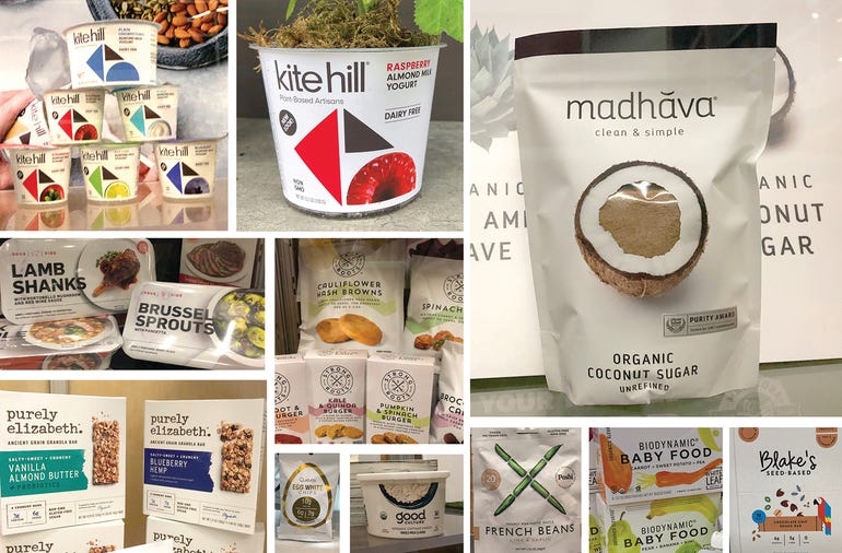
Ok, maybe renaissance is too strong of a word. After all, the use of white as a canvas or background never went away, but I must admit I saw even more white packaging than in recent years. Check out the branding evolutions of Kite Hill and Madhava. The use of white suggests health and purity (an important message for Madhava) and allows colors and imagery to pop. As always, the watch-outs for white are words like generic, medicinal or sterile. However, all of these brands are putting their own spin on the use of white to keep things fresh and appealing.

Put a pattern on it
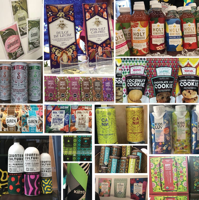
This year I saw more colorful patterns at Expo than a trip to Nordstrom. Clearly packaging design is taking a page out of the textile design book. Patterns are a great way to create a memorable look. Dry Organic Soda is using pattern to tell a story about flavor, while Kids Luv is using it to take you to a new world. Patterns have been a popular differentiator for fine chocolate brands and beauty brands, but are now everywhere. They become that distinctive wallpaper to express the personality of your brand.

Soft and sweet
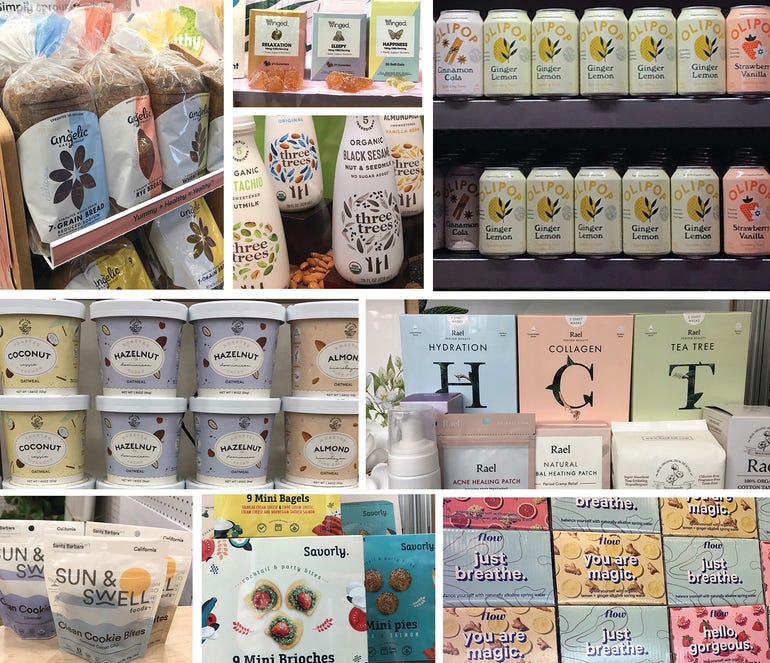
Since the birth of millennial pink, pastels have been hitting the shelves hard. It was one of the trends I highlighted last year and is clearly here to stay. This year, however, I noticed an increase in the soft and sweet nature of the design paired with trendy pastels. Take, for example, the delicate details of Rael, Savorly, and Mylk Labs, or the vintage-inspired illustrations of Olipop. These details suggest an inherent thoughtfulness of the brand and products inside.
Alicia Potter is the founder and creative director of Boulder-based Faven Creative, specializing in food and beverage branding and packaging design.
About the Author(s)
You May Also Like


