Subscribe and receive the latest updates on trends, data, events and more.
Join 57,000+ members of the natural products community.
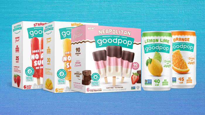
Bright colors, bold messaging and contemporary designs are the hallmarks of these recent natural product rebrands.

How does a brand capture the identity of its products? How does it tell its story, educate consumers and grab their attention in the sea of products on supermarket shelves or online?
These are questions brands struggle with every day—questions that become even harder to answer when it comes time to make the often difficult decision that a current design might not be conveying the right message, or that a product has simply outgrown its look.
There’s no shortage of research, doubt and, ultimately, courage and excitement that go into rebranding, especially when the products at hand are ones that consumers have come to identify with a certain image. Fortunately, the rewards can include gaining new customers, inspiring old ones and better communicating brand values.
The following packaging redesigns are a roundup of some of the standouts we’ve seen so far this summer.
You May Also Like