Subscribe and receive the latest updates on trends, data, events and more.
Join 57,000+ members of the natural products community.
Say good-bye to 2019's "Living Coral" and hello to calming hues in the "Classic Blue" family.
.png")
After a year’s worth of colorful and eye-catching branding awash in gorgeous muted corals accented with yellows, greens, oranges and purples, Pantone has bid farewell to “Living Coral,” its 2019 “Color of the Year,” a sweet and optimistic—if not slightly desaturated—pinkish hue. This color was chosen for its uplifting playfulness and oceanic connotation. In its stead, the company has taken a more somber approach to the new decade with the announcement of “Classic Blue” as the 2020 “Color of the Year.”

According to Pantone, the hue is “a timeless and enduring blue … elegant in its simplicity.” The company chose it because the “reassuring qualities of the thought-provoking Pantone 19-4052 Classic Blue highlight our desire for a dependable and stable foundation on which to build as we cross the threshold into a new era.”
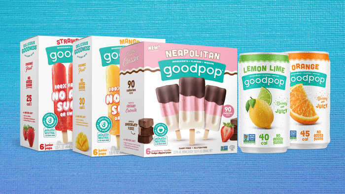
It seems that the natural products industry is one step ahead of the game, however, at least where Pantone is concerned. Various shades of deep blue—sometimes so intense they verge on black—have appeared on an increasing number of products in recent months. This is particularly true for many of the recent product rebrands that we’ve seen this winter and fall, suggesting that blue is on track to make a huge splash this year.

Two other design trends that we expect to see more of in the new year are matte colors and packaging finishes that steer away from the ultra-gloss look of previous years. Chief Creative Officer Derek Springston of Moxie Sozo, the Boulder based agency that is responsible for many of the most recognizable designs in the natural products industry (think HopTea and Icelandic Provisions for starters).
He expects to see more bright colors in the coming months, in addition to ultra-clean labels and great typography. And while the retro look and vintage-style illustrations will certainly still be popular, Springston emphasizes that the important thing is for brands to differentiate their products on store shelves. “If the competitor has a vintage design… you need to do something different to stand out.”
“At the end of the day,” Springston says, “you’re hopefully creating something new and fresh and that the brand truly owns.”
You May Also Like